
Lead UI/UX Designer
Enabling knowledge exchange to make learning social
2019
Role
I led the design and mentored rotating junior designer interns.
Outcome
We refreshed the brand and image of the app. Conversion rates doubled in the first quarter after the redesign.
Team
- Nuri Bayram - Product Manager
- Myself - UI/UX Designer Lead
- Nikhil Shrestha - Dev Lead
- Contributos - Jr Design Interns
Overview
What I found
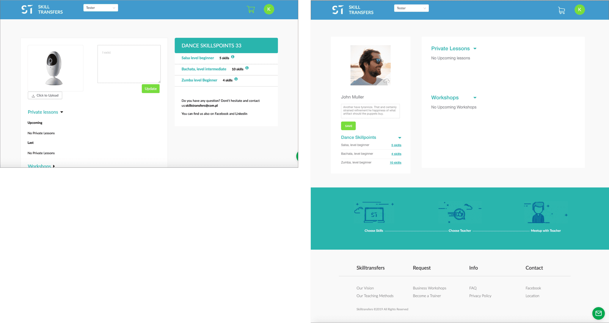
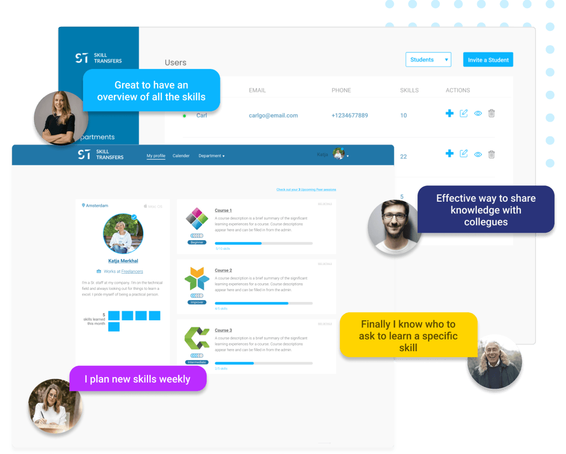
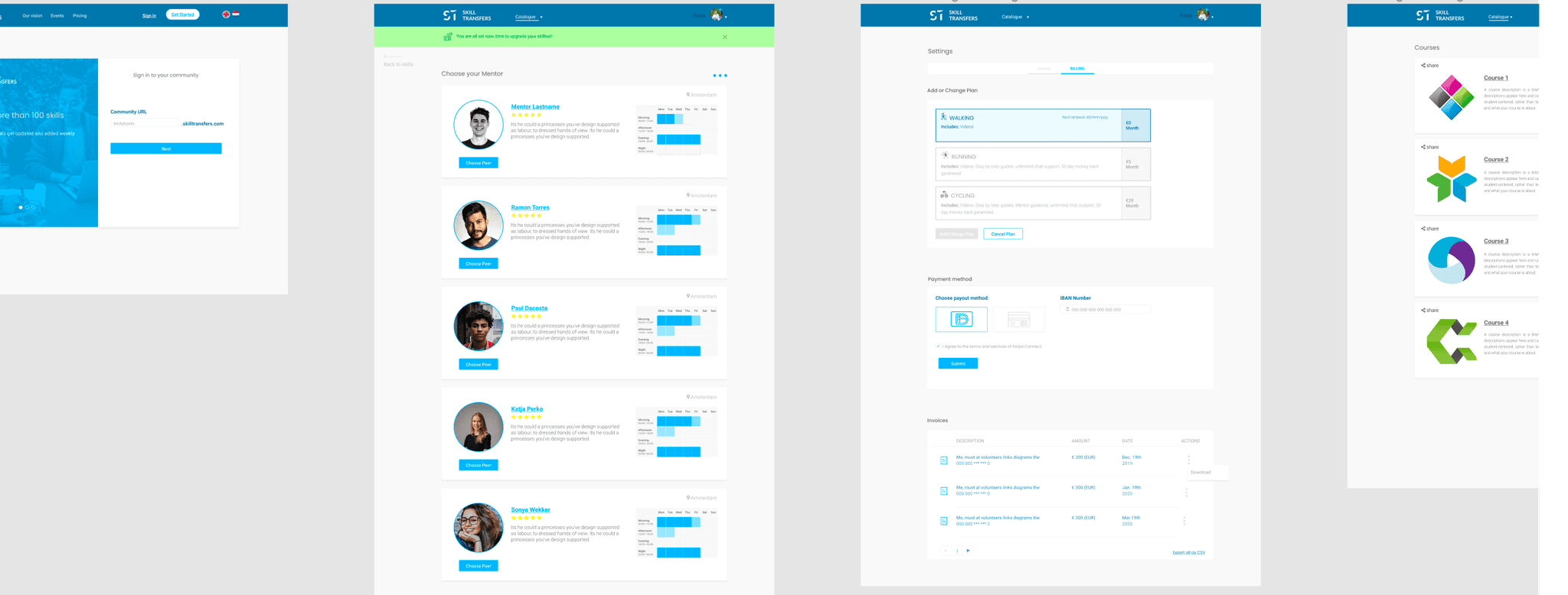
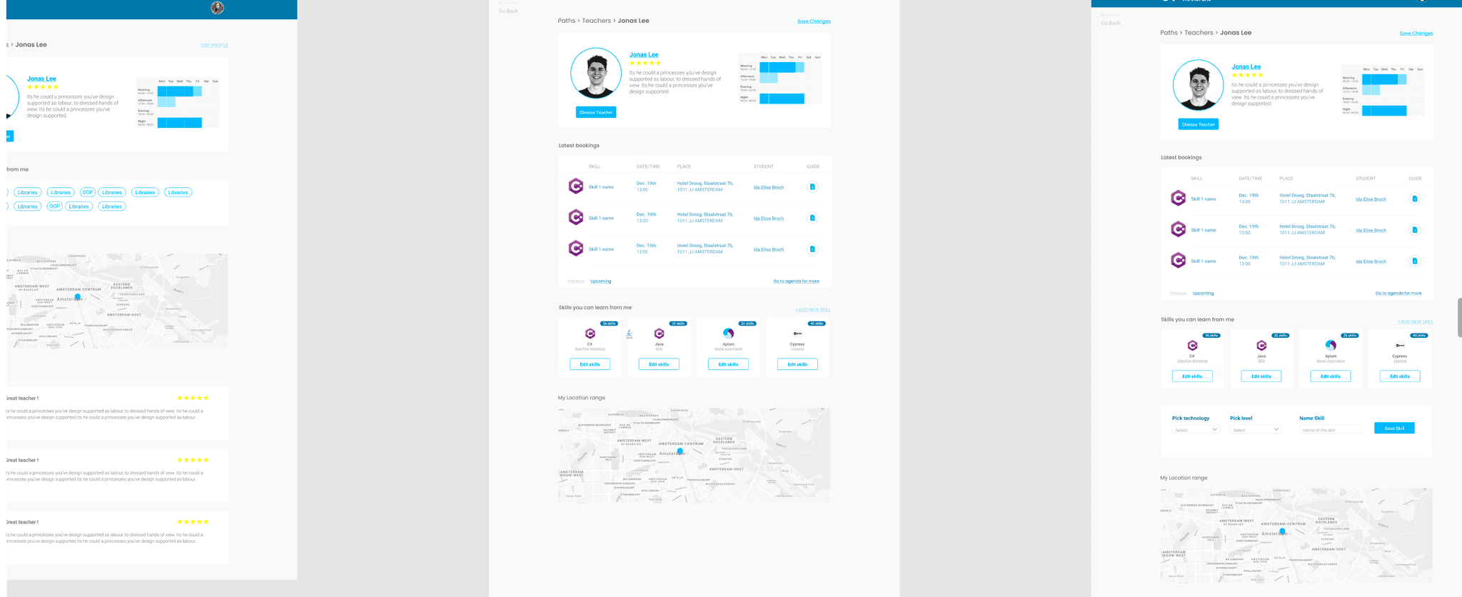
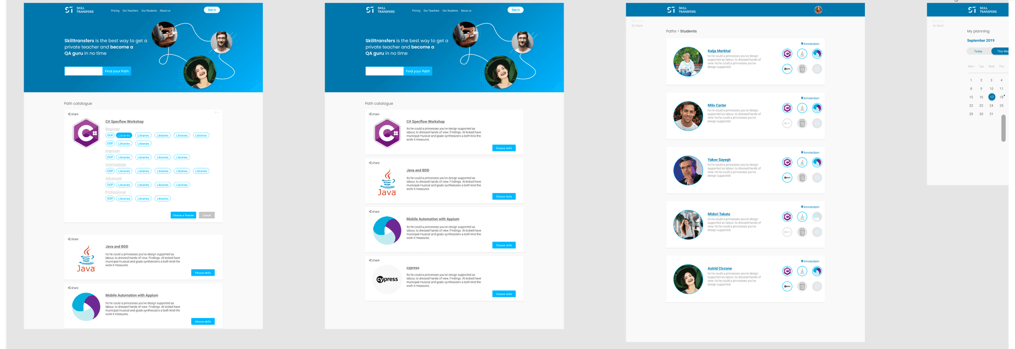
Skilltransfers is a platform where users can trade skills. Instead of following a specific program or course, you can hand-pick the skill you want to learn and find a person who possesses that skill at the desired proficiency level. Then, you can arrange the exchange either by trading skills or by exchanging skills for money.
When I joined the project the Application was half made but in concept stages when it comes to visuals and the development was ahead of the design by miles. The couple of views that were ready and some of the mockups I saw had sections with lots of potential and others that that could use some improvement.
So after studying the business rules, goals, direction of the app off I went to take the best of what we already had, improve what had potential, create what we needed to have a complete experience, and achieve the purpose of the app.
Goals
Building trust
Our primary goal was to improve the perception of “trust” that people had when interacting with the web app. Basically to refresh the look and feel. To achieve that we needed to do the following:
1. First, we needed to create a visual language.
2. Second, Improve the copy, especially the tone of voice, which needed to be more concise and friendlier. We needed to make sure that people would understand the proposition model of the platform.
3. Discover what were the conversion points in the app and rethink the parts that were detrimental to the goals of the application.
Research
What’s the real problem?
To be able to reach the goals we stablished once we talked about the product story. To understand if what was already deployed was helping the stakeholders to prove that this app was solving the problem that was crated to solve and is it reaching the right target.
To understand better what we were dealing with we started off with a heuristics analysis:
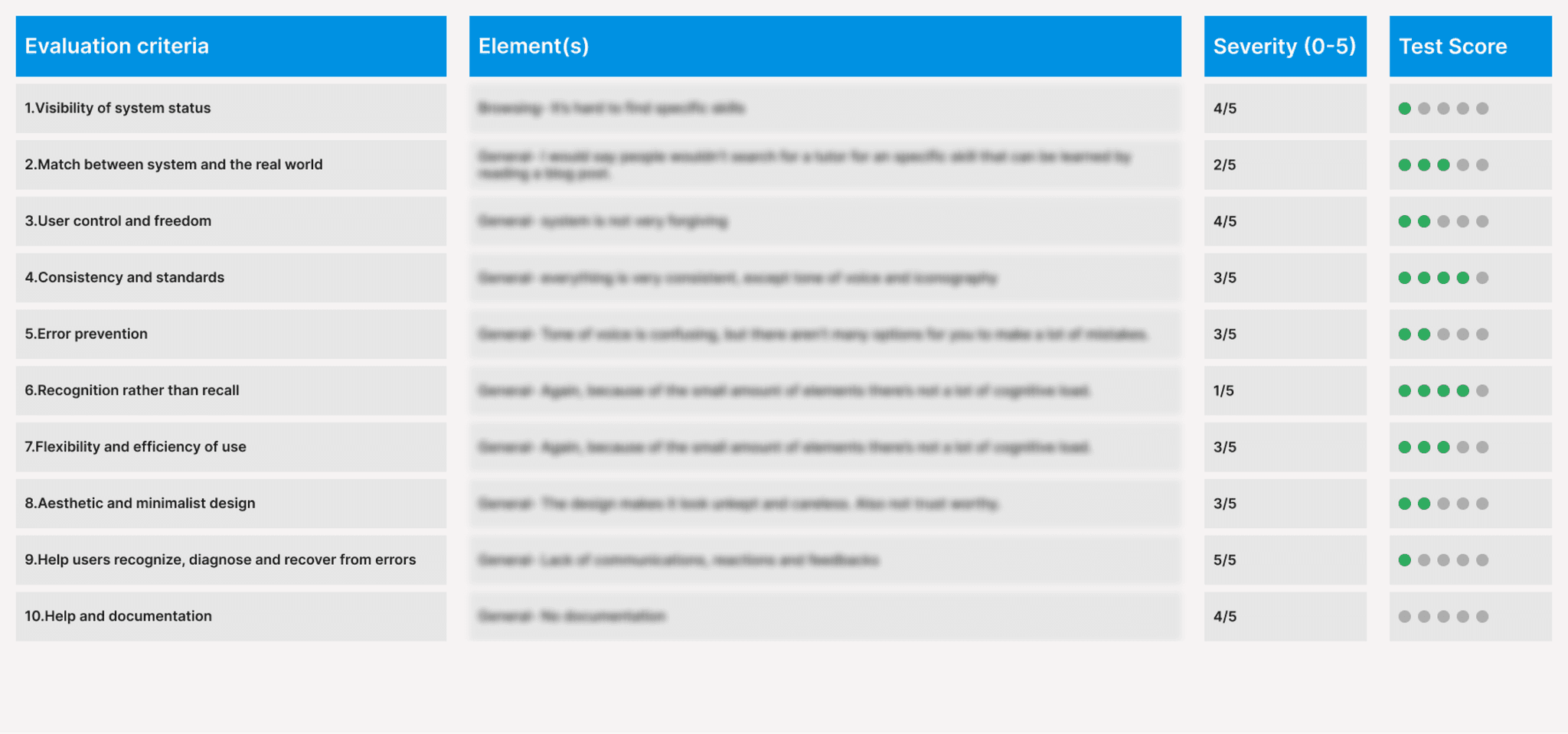
We used Jakob Nielsen’s playbook as a base for the heuristics evaluation. Then we used those pointers as criteria to critique the elements listed in the right column. We rated the severity based on how much of a hindrance it would be for the user to complete their tasks or the level of disturbance that would add to the full experience of the app.
On the far right of the board, we kept track of the results of the round of guerrilla tests we did in order to validate the previous evaluation. As we thought in some cases what we thought was a problem and sometimes even a critical problem turned out to be of not much importance for the real user and in some cases it was the opposite.
Personas
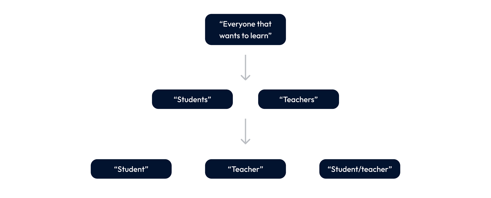
When we discussed the product story, what problem was it aiming to solve, and which audience were we trying to target? The definition I received from the stakeholders was quite broad. I decided to delve deeper because when someone mentions that they are developing an app for 'everyone,' it often means you end up designing for no one. The same principle that applies to emergencies also holds here: 'If everything is an emergency, nothing is an emergency.' So, here is how the conversation unfolded:
I took the notes from the conversation and checked with the people that had used the platform in the past or had been somewhat interest in it, to understand why and how did they think it was going to help them in their learning journey.
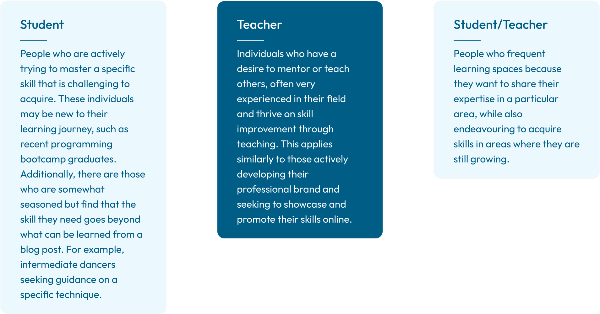
After gathering as much information as possible and documenting all the important patterns we could gather from the people we talked to, it all boiled down to:
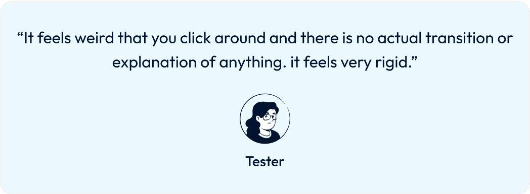
Unforgiving interface
The interface lacks clear user affordances, making it challenging for users to interact with the elements due to the absence of indications on what is clickable and what isn't. This gives the interface a somewhat dated and 'old' appearance, leading users to feel skeptical about the reliability of the service. Consequently, it becomes difficult for people to maintain interest, let alone engagement.
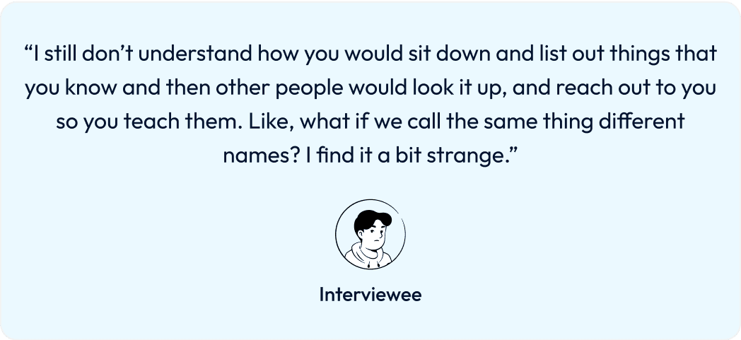
Unclear vision
We observed an interesting pattern when discussing the app concept with people in our network. Many required a lot details to grasp the purpose of the platform. Recognising this, I incorporated these insights into my conversations with interviewees and those testing the live version of the platform.
Uncertainties and unclear aspects were identified for further discussion with stakeholders. These points needed clarification and improved conceptualization, particularly in relation to the market fit.
When your target audience struggles to connect with your product story, it may indicate a misalignment with the intended market.
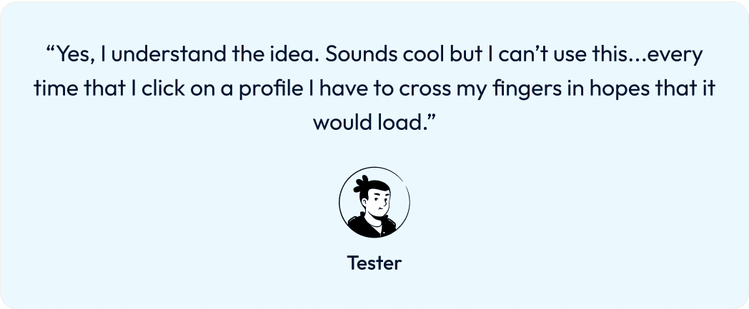
Technical problems
A lot of things were not responding or had unexpected behaviours through out the test rounds.
Solution
Finding the right balance
All this input pathed the way to our critical problems. So I started working on different proposals we could discuss and start testing soon.
Results
Impact
After the redesign launch, we saw some encouraging outcomes. Our conversion rates experienced a notable increase, doubling in the first quarter. This boost in conversions had a positive impact on our bottom line, contributing to revenue growth.
The redesign also had a positive effect on user trust. Users perceived our platform as more reliable and trustworthy, which was an important milestone for our brand.
In a strategic move, we successfully introduced our new design to local schools, a segment that had been challenging to engage with in the past. This move opened up opportunities for collaboration and expansion in the education sector.
Furthermore, our revamped platform gained attention from competitors in what was previously a monopolized market. This increased visibility positioned us as a credible player in the industry, leading to discussions about potential partnerships and collaborations.
In summary, the redesign led to a significant increase in conversion rates, improved user trust, expanded our presence in the education sector, and elevated our profile in the industry. These outcomes marked a positive step forward in our journey toward continued growth and success.
Lessons Learned
Retrospective
1. Product research is often underestimated. Understanding the fundamentals of market analysis, identifying your target audience, and discovering opportunities to shape your product ideas are more crucial than people often recognize. While diving into hands-on production is commendable, it's essential to be mindful of the 'moving target'—meaning the market you are targeting or are already part of may evolve rapidly. Keeping yourself updated is paramount.
2. Embrace granularity. Break down tasks, test them, and iterate. Avoid prolonged delays in prototyping and testing. In the realm of a comprehensive redesign, it's easy to become immersed and create extensively before validating through testing.
3. Communication is of utmost importance. I had the privilege of collaborating with a highly skilled group of developers based in Nepal. Despite the time zone differences, effective communication was maintained. Leaving comments, notes, and providing documentation throughout the app redesign proved instrumental in helping them grasp necessary adjustments and understand our priorities.
Karen Acosta 👌 2026